
When it comes to decorating your home, colour is one of the most powerful tools you have in your back pocket. It sets the mood, influences how big or cosy a space feels, and all in all – really ties everything together. Here’s the tricky part (sorry); it’s not just about picking a shade you like., it’s about making sure your furniture and colour palette work together in harmony. Your sofa, dining table, and bed are the stars of the show, so the right colour combination can completely transform your home.
So, how can you make sure your furniture complements your home’s colour palette instead of clashing with it? Here’s our guide to getting it right:
Start with a Base Colour
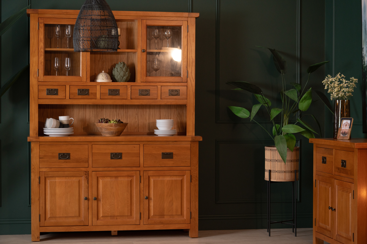
Most homes already have a base colour in place, often on the walls or flooring. Neutrals like whites, greys, and soft beiges are the most common, because they can provide a flexible backdrop for furniture in bolder shades. If your base colour is already making a statement (i.e., a deep green wall, or patterned wallpaper), your furniture should balance it out with more subtle tones.
The Kingston Dining Range is a great contender if you’re not sure. Its warm oak finish works beautifully with muted neutrals, but also stands out against rich wall colours like navy or forest green. By choosing pieces that either blend seamlessly or contrast intentionally, you create cohesion rather than visual clutter.
Understand Warm vs. Cool Tones
A lot of the time, colour harmony often comes down to undertones. Warm tones (reds, oranges, yellows) feel cosy and inviting, while cooler tones (blues, greens, greys) are calming and serene. Matching your furniture to these undertones is the key to getting it right.
- If your palette leans warm, look for furniture with earthy finishes; rich woods, tan leathers, or fabrics in terracotta and cream.
- If your palette is on the cooler side, go for greys, charcoals, or soft blues in your upholstery, as well as sleek glass or chrome accents.
Our Parker and Muse sofas fit right in and naturally complement warmer palettes, but the Lansdowne is a great choice in a cool-toned colour scheme.
Use Contrast Wisely
While we do want everything to go together, it’s important not to be too matchy-matchy in your colour scheme. Let’s face it, a room where everything matches perfectly can sometimes feel a little bit… boring… flat, even. You need contrast to add energy and help your favourite pieces shine. A light sofa against a darker wall, or a bold accent chair paired with a neutral colour scheme is a great way to get that balance just right.
If you’re unsure, a good trick to follow is the 70/20/10 rule;
- 70% of your space should be your main colour (walls, flooring).
- 20% should be a secondary colour (use this for your larger furniture pieces).
- 10% should be accents (this is where things like cushions, lamps, and throws come in handy).
Bring in Textures and Materials
Colour isn’t just about paint and fabric – shocking, I know. It’s also about materials. Natural wood tones, metal finishes, and even stone can all contribute to the palette. Think about how your furniture finishes sit alongside your flooring and wall colours – this can help you to find the right balance.
If you’ve gone for light, airy colours, a darker wood like walnut or mango creates a beautiful contrast. On the other hand, if your walls are bold, lighter finishes (like white-washed wood or acacia), keep the room feeling balanced. The dark wood in the The Fortune Dining Table is great for instantly anchoring a lighter-coloured space.
Don’t Forget Accents
Once the big pieces are in place, it’s the smaller accessories that complete your colour palette. Scatter cushons, rugs, lampshades, and wall art can all tie your palette together and link your furniture to the rest of the room. the best oart? Accents are easy (and affordable) to swap out when you want a refresh!
Trust Your Eye
While there are plenty of design ‘rules’, the most important thing is that you love the space you’re in. Don’t be afraid to experiment; whether that’s layering tones of the same colour for a calm, cohesive look, or going bold with complementary shades for a more dynamic feel.
The beauty of furniture is that it isn’t just functional, it’s a part of your home’s personality. By choosing pieces that connect with your colour palette, you create spaces that feel intentional, stylish, and uniquely yours.
Do Hue Get It?
Matching furniture to your home’s colour palette isn’t about perfection, it’s about finding the perfect balance. When all your colours, tones, and textures all work together, your home feels balanced and inviting. Whether you’re drawn to soft neutrals, bold hues, or somewhere in between, the right furniture choices can make your colour scheme shine.
We offer a wide range of sofas, dining sets, and bedroom collections designed to work with every colour palette. So whether you’re starting from scratch or just looking to tie your room together, you’ll find pieces that fit seamlessly into your vision.